Hey again! Let's continue from where we left off.
So, in Part 1, I talked a bit about colors and shapes (and silhouettes, which are basically just combinations of shapes). In this part, we'll dive deeper into principles of character design revolving around colors and shapes, and use existing Pokémon designs as examples.
Before we start, a disclaimer: this is a ramble, and not an essay. I am probably not going to do much in providing sources because trying to look for sources that would specifically state the things that I have learned over many years from many sources and personal experience is one of those most annoying things out there for me. This is why I encourage people to look into these things further through individual research if they want to get some more trustworthy and carefully written sources (provided you don't just get served endless AI slop whenever you try to find anything). I will be providing credit for the images I use, though. No excuse in not doing that. For one, all official art of Pokémon I feature in these posts has been found through Bulbapedia unless otherwise stated.
Okay, let's get to it, then! Starting with…
Color
The most important role of color in Pokémon designs is to signal the type of the Pokémon. This elemental color-coding is shared with a bunch of other franchises or works with elemental magic in them, such as Avatar: The Last Airbender, where different people from different nations where different elemental powers are used have different colors that match their element. It's just a very useful shorthand, and in Pokémon, there's the added need for it - when you see a new Pokémon, you should be able to guess what type it is in order to use a super-effective attack, or at least avoid using a not-very-effective attack.
So, you already know how this color-coding works. Many types have a pattern of using a certain color - fire uses red or orange, electric uses yellow, grass uses green. However, while there are a lot of blue Water-type Pokémon, it should be noted that the information of a Pokémon being a Water-type is often also or instead communicated through the choice of a water-dwelling animal, most obviously a fish. You can look at a Magikarp and, despite its orange and yellow colors, deduce that it should be a Water-type.
Some other types also use morphological clues like these in order to communicate the type rather than using color. Fighting-types look like they can fight, Flying-types look like they can fly, Bug-types look like they're bugs, Dragon-types look like they're dragons (some of the time, anyway) - but you can't really see these types stick to particular distinct colors.
But back to color. I mentioned in the previous part that a Pokémon design usually uses 2-6 colors, and that these colors have a hierarchy to them. As earlier stages of a line tend to be less complex than the later stages, they also tend to have fewer colors, though not necessarily by much - using the same colors in different parts of the evolutionary line help signal to the player that they are connected, and changing the color palette too drastically can impede this. Of course, sometimes Pokémon do change drastically between stages - like Feebas to Milotic or many bug Pokémon, in which case typically the thing that makes them work as a line is some kind of idea that connects them: Feebas and Milotic are still both aquatic (and the whole gimmick of the line is that it's a massive glow-up), bug Pokémon are modeled after real life insect metamorphoses, Yamask is a golden death mask that turns into a golden sarcophagus in Cofagrigus - both golden ancient artifacts that existed in Egypt, relating to death.
Ah, I've veered away from color again! Well, let's get into how colors are actually (presumably) chosen for Pokémon. There's the base color that can be determined for you by the type, but what about after that? Well, that requires us to get a bit into color theory.
Color schemes tend to be decided with some tried-and-true patterns regarding hues. But what does "hue" mean? "Hue", as a word, essentially describes what part of the rainbow the color best matches up with. The words "red", "green" and "blue" describe hues, for example. "Dark red" and "pale red" can be assumed to have mostly the same hue, even if they are different shades/tints/tones of color. Those three words that I just said refer to mixing a pure color with black, white and gray respectively, but as we go on, it's going to be easier if I just refer to all of the variations of a certain hue "colors".
As for the patterns, here are a few terms describing the combinations of hues that are often used in design:
(source:
https://expertphotography.com/complementary-colors-photography/)
Of course, these are also going to depend on how exactly what version of the color wheel you're using, and there are different opinions on how that should be done. However, the general notion of using hues close to each other or hues that are far apart still remains.
Let's look at some Pokémon as examples now, though!
Cyndaquil uses four colors and three hues. The colors are the dark teal on top, the cream underneath, and the striking red and yellow of the flame. The cream and the yellow part of the flame roughly share a hue, but the cream is paler, so they register as different colors. This combination of three hues which are spaced apart quite evenly on the color wheel makes for a triadic color scheme.
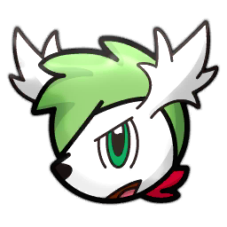
Drifloon uses three or four colors, and it uses two hues. The colors are white, purple, yellow and black, if you want to count the black, which I mentioned in Part 1 doesn't necessarily count because eyes are already expected to contain black. The hues are purple and yellow. Black and white do not have any particular hues, so they do not count towards the count of hues. As purple and yellow are on opposite sides of the color wheel, this makes for a complementary color scheme.
Smoliv uses three colors (ignoring the small amounts of black, white and pink in its eyes and mouth), which are all three subtly different hues of green. The olive on top is the yellowest of the greens while the leaves are the bluest of the greens (they might not look very blue, I know, but as they are moving towards blue on the color wheel, they are comparatively blue). This makes for an analogous color scheme.
Added note: wow, it's not so easy to find Pokémon with analogous color schemes that aren't just gray or brown! Pokémon really loves to give designs with otherwise analogous color schemes eyes which use a bright complementary color, ultimately leading to a split complementary scheme.
Anyway - there is also another secret to these designs and most other Pokémon designs that works towards their easy readability and recognizability. This is the fact that, turned grayscale, the differently colored areas are still recognizable as differently colored! See for yourself:
Well, Smoliv's olive and main body are very close together, but so are the hues.
Something to also note: not all grayscale converters work the same way. The particular converter I used to make these seems to work in the arguably "correct" way - having different hues produce different light values relative to each other based on how bright they are perceived by the human eye rather than all having the same values which lazier converters would do. Here's an RGB (red-green-blue, as opposed to the red-yellow-blue color wheels from before - the former is used in digital displays while the latter is used for paints due to reasons that are interesting but ultimately irrelevant for this ramble) color wheel put through the same converter:


You can see that different hues, especially yellow and blue, are perceived with different brightnesses. This is something to keep in mind for your own designs - don't blindly trust the lightness or value measurements in your digital drawing software in order to determine what color is brighter than another, use your eyes! (Or some other tool you trust to give accurate information as to how most humans perceive color if you have some condition that makes you unable to perceive the full range of colors).
I think that's enough about color for now. So, let's move on to…
Shapes
Before we go on, I have a small clarification to make to what I've written before. I said that Pokémon "employ" 2-6 recognizable shapes in their design. By this I do not mean that you can use only 2-6 shapes to construct most Pokémon, no. That falls apart in a lot of cases where the Pokémon is based on an existing living creature with more complex morphology than, like, a fish. What I mean is more that, when you look at a Pokémon, you see shapes that have been integrated into the design. The most obvious examples of this is Zigzagoon which integrates, you guessed it, zigzags. Have a look:

Zigzagoon is so min-maxed to give off a zigzag energy that it can be tough to find other shapes in it, but they are there - do you notice how both the ears and the tail are narrow at the base and wider at the end with the ends' edges being zigzagged? That's another shape. Basically, if there is some part of the body in a design that looks like it has been specifically made to be a different shape from what it would be in the real life counterpart, that's a solid contender for a body part with an integrated shape. The mouth, for example, isn't zigzagged in a real life raccoon (or badger or tanuki or any other mammal Zigzagoon is inspired by), but it is here, and that's to further cement the whole zigzag motif in the design.
This all isn't to say that nothing that is shaped close to how it is in real life can have an integrated shape, mind you - but that's getting into the weeds. Let's move on for now.
As I said, these specifically integrated shapes are not the only shapes of the design. The previously mentioned Pokémon that are modeled after real life creatures with complex morphology have a lot of elementary shapes that make them up, and these shapes can be deformed or molded together. The reason I still insist that these shapes exist is that Pokémon would be really hard to draw or model consistently otherwise. Artists hardly draw complete images without sketches in between, and these sketches most often involve breaking the subject into simpler shapes to help visualize and project them.
Back to the point: the shapes that Pokémon are constructed from, while occasionally deformed and molded together, still tend to be
readable. By "readable", I mean that (most of) you can look at an image or screenshot of a Pokémon and get an understanding of what kind of three-dimensional shape it has despite only seeing one angle. Of course, there are bad angles, as there always are, but a design being readable from the most photogenic angles is usually enough. In general, a good indicator that there is a problem with readability is when you or someone else looks at a picture of the design and goes "what am I looking at?". You don't want that. Usually, anyway. Something you'll find is that there are a lot of rules in character design that can sometimes be broken to elicit a certain unique effect. If you're trying to make something
marketable, though, you're better off keeping readability as your friend.
Let's look at some more Pokémon. How about Snorunt again?
Snorunt is one of those Pokémon that
is constructed from simple shapes. Draw a cone and you're basically halfway there. To actually make it Snorunt, though, you have to cut the front of the cone off in that specific pattern, add the right face on what's underneath, add the sphrerical hands, the ellipsoid feet (which are a bit irregular as they have to function as feet) and finally the markings on the coat. Pretty understandable, even if the shape of the creature underneath the coat is a bit ambiguous in official art due to that shadow seeming to obscure the top of it. You can see in that reference sheet, though, that it has indeed been decided, and that it is a kind of egg shape. It is also far more apparent in the 3D models in the games.
Okay, let's look at something way more complex now: everyone's favorite, Lucario!
You may be able to imagine that it would take a lot more work to break this all down into simple elementary shapes. However, the shape of Lucario's body is still
readable due to the fact that it resembles familiar existing creatures - humans and canines. You have seen many humans and dogs before, so you know how those things are shaped.
Notice, though, that the additions made to these real-life inspired components design
do tend to be simpler, less complex shapes because you wouldn't have a point of reference to compare them to otherwise. The aura feelers are shaped like teardrops, the chest spike is conical, the hand spikes are like… I don't really know how to describe them in words - half-almonds? Regardless of that, I have a pretty clear idea of their 3D shape and what it would feel like to wrap my hand around them. That's the power of the shading and the way their outlines curve.
So, Lucario is readable. You will still remember how Lucario is shaped after you look away because your memory can easily store that information. One Pokémon that at least I used to have trouble with in that regard, though, is this guy:
Necrozma's base form is one of those rare Pokémon designs where you
do go "what am I looking at?" and I believe that that's intentional - Necrozma's base form is supposed to be in an incorrect form where the parts of its real body are jumbled and rendered unrecognizable due to the fact that they aren't arranged in a way where they make sense. In Ultra Necrozma, though, the odd body parts finally make sense:
They were parts of a dragon! I have to admit - when they first revealed Necrozma in its base form, I hated it. Thought it looked like a child's MS Paint drawing. I still don't
like looking at it, but after the reveal of Ultra Necrozma, I could see the intention and respect it.
But that's a lot of talk about 3D shapes - let's get back to 2D shapes, like the ones we talked about with Zigzagoon. The markings and patterns on a Pokémon and the way their outlines are smooth, jagged, wobbly or so on. What else can we way about those?
Well, once again, this is another aspect of design that has been used to signal the type of the Pokémon. There are many Fire-type Pokémon with flame patterns, Electric-type Pokémon with fuzzy fur as if it's been electrically charged, Rock-type Pokémon with shapes that resemble naturally occurring rock formations. I can also think of at least one type that tends to
avoid certain shapes - can you think of many Water-type Pokémon that have a particularly
spiky design? Water is rarely spiky, and the same goes for water-dwelling animals.
I want to talk a bit more about Jolteon: Eeveelutions are a fantastic case study in how shapes and colors are used to convey type information in Pokémon. A pet peeve of mine is when fakemon artists draw fake Eeveelutions that try to do something
too clever with their designs when the point of an Eeveelution, based on the canon's sample group, is to be as obviously representative of its element as possible. (Umbreon is a bit of an outlier as it used to be Poison-type earlier in development.) I don't say that in any attempt to stop anyone who reads this from making Eeveelutions that are subtle about their type, though - I'm not that big of a curmudgeon. As said, it's just a pet peeve.
Let's see, what else? Well, we can't really talk about shapes in character design without talking about shape language. Stop me if you've heard this before: round is friendly and safe, triangular is dynamic or dangerous and square is strong or stable. But wait! Are they? Here's a very round design, and a design made up almost entirely of triangles. Can you guess which one is your friend and which one is your enemy?
Yeah, the zombie is your enemy and the butterfly is your friend. Shapes aren't everything. The thing that looks infected and grotesque is going to look infected and grotesque regardless of what shape it is, and the rainbow-colored sparkly pretty thing is going to be pretty even if it has sharp points.
This isn't to say that those initial notions about round being friendly and so on have no truth to them. Winnie The Pooh is going to be more huggable if he has no sharp corners, and he will thus be more marketable, and it's easier to signal to a child that Jafar is not to be trusted when he looks lanky and pointy… although the evil ass color scheme will probably clue them in as well. Sorry, I couldn't find a great example of a triangular villain with non-evil colors on short notice.
How does this feature in Pokémon? Well, Pokémon does tend to have a lot of round designs because round things tend to be cute and approachable, and if I recall right, the designers have gone on record stating that every Pokémon should look like it could be your friend. I think the only very sharp Pokémon I can think of right now is Vikavolt.
This highly angular design, though, has a reason to be there, as it pretty effectively signals to you that this thing is fast (because triangles are dynamic and so on and so on). It also suggests an element that can keep up with this speed, that being Electric.
Something else that Pokémon employs in order to increase the cuteness and marketability of their designs is their proportions. You may remember that one criticism that modern Pokémon gets, especially for starters, is that their heads are too big. Indeed, certain modern Pokémon designs have pretty large heads compared to corresponding older designs. Here are Squirtle and Sobble:
Yeah, Sobble has quite the noggin on him. As for whether this is a bad thing, I don't really have much of an opinion. If you want to take anything away from this, it's that Pokémon design isn't the same now as it was in the beginning. Actually, I watched a video about that some time ago that I thought was pretty neat. Check it out
here.
Anyway, back to proportions. I probably shouldn't even have to tell you that most Pokémon lines have proportionally larger heads at the beginning and proportionally smaller heads at the end. This is because human children, and the children of a lot of other creatures, have proportionally larger heads when they're young than when they're old. Pokémon are supposed to grow alongside you on your adventure and become stronger, and adults are usually stronger than children.
I think that's all I can think of to talk about colors and shapes for now, and I didn't really have much to add for the silhouette and unique face points from the first post. So, with that, I'll leave you again until next time when I'll get into my personal Pokémon-inspired monster designing process. Hope you enjoyed!


 - Incredible Characters Wiki")


